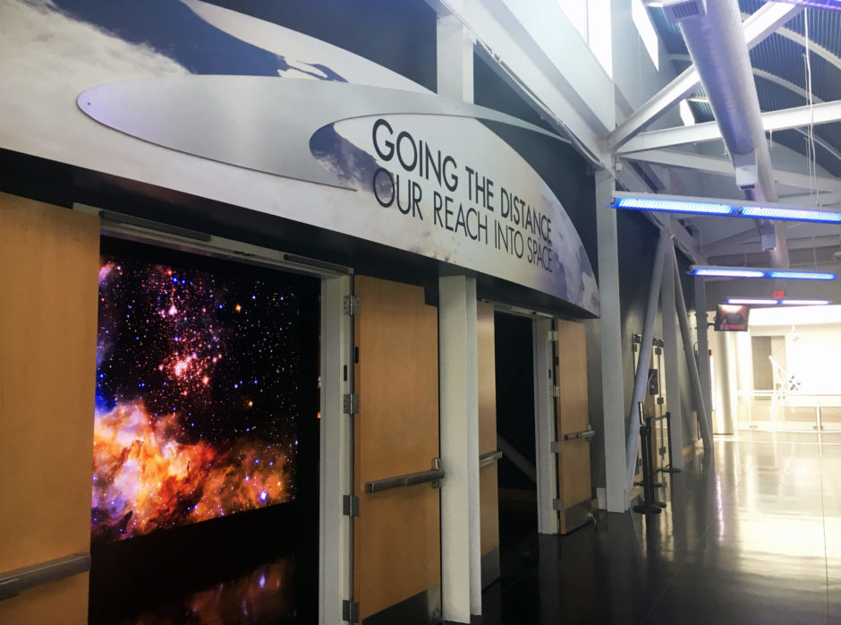
Going the Distance: Our Reach Into Space
—
Exhibit Visual Identity
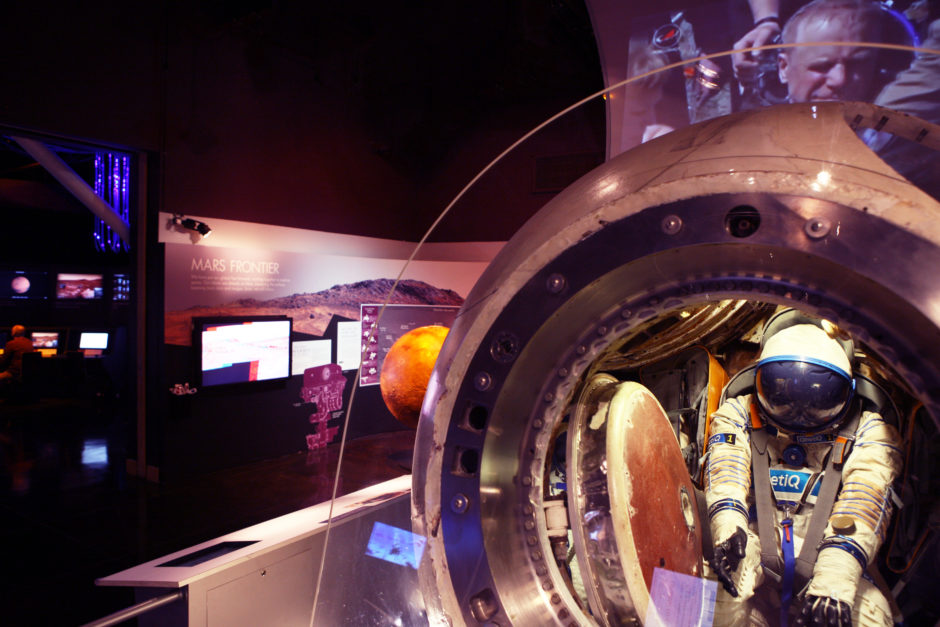
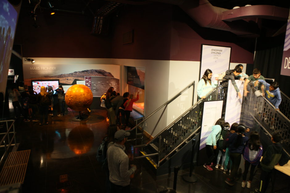
This permanent exhibit at Chabot explores how humans are expanding our boundaries by moving farther into the Universe than ever before. With inspiration and content provided by NASA Ames Research Laboratory, Caltech’s Jet Propulsion Laboratory, Planet, and SpaceX, the exhibit traces our journey through the cosmos, and where we are headed.
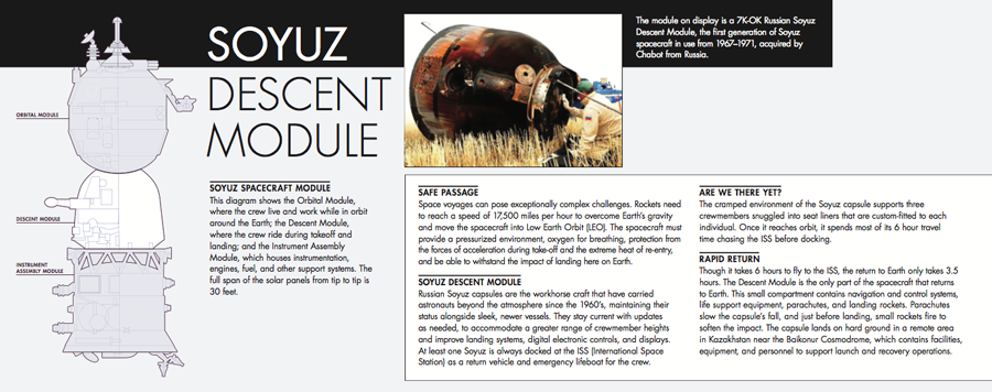
I was the graphic designer for this exhibit, which was completely replacing a very dated exhibit of Soviet relics. My involvement included everything visually-related: I selected the color palette for the exhibit, created all of the signage and decals, selected and worked alongside the fabricators, designed the entryway awning, and I helped to install the signage. I also came up with the title for the exhibit.
The colors that I chose for the exhibit were intended to be warm, and have a glowing effect. I wanted the colors to strike a balance between masculine and feminine, to appeal to all audiences. I chose a dark matte black for the walls of the first room of the exhibit and a light silver-gray for the second. I used Futura as the font throughout, Chabot’s new Center-wide font. My aim was to age-up the graphics for the audience (we have many elementary-age field trip students at Chabot), to invoke a sense of approachability but authenticity, and legitimacy of the subject matter.
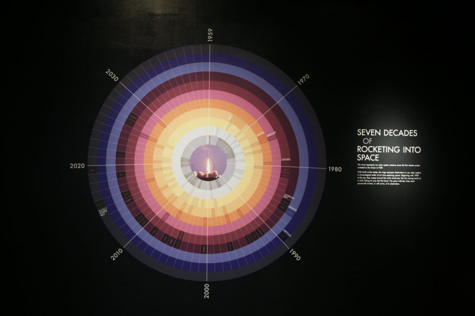
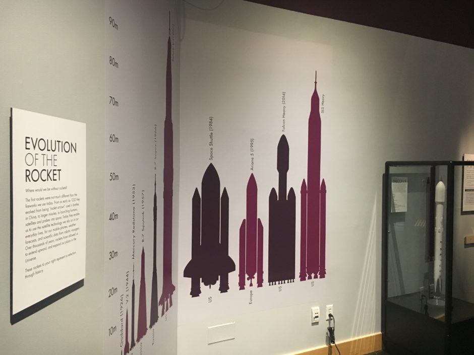
It’s organized by distance in relation to earth—earth being the center, actually a photo of a rocket taking off. It starts with the moon (as a light gray band) and extends out to Pluto / Kuiper Belt (as a dark gray-blue band). It includes projected missions for 2020, and a currently uncharted decade of 2030. While the text appears small when photographed, it’s legible in person.